CSS Box model
The CSS Box Model is one of the most fundamental concepts in web design. It defines how elements are sized, spaced, and displayed in a webpage layout.
Understanding this model helps you control the spacing, alignment, and responsiveness of your design.
Understanding this model helps you control the spacing, alignment, and responsiveness of your design.
What is the CSS Box Model ?
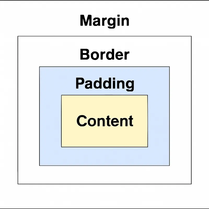
The Box Model describes how the browser wraps every HTML element in a series of boxes. These boxes determine an element’s:
The Box Model describes how the browser wraps every HTML element in a series of boxes. These boxes determine an element’s:
- Size
- Spacing
- Layout on the page
Components of the Box Model
Each element is made up of four parts:
1. Content
2. Padding
Each element is made up of four parts:
1. Content
- This is where text, images, or other content appears.
- You define the size of the content using the width and height properties.
2. Padding
- Padding is the space between the content and the border.
- You can control padding on each side: padding-top, padding-right, padding-bottom, padding-left.
padding: 10px; /* applies to all sides */3. Border
Box Sizing Property
- The border wraps the content and padding.
- You can style borders using:
- border-width
- border-style
- border-color
border: 2px solid black;4. Margin
Box Model Layout Visual
- Margin is the space outside the border, separating the element from its neighbors.
- Like padding, it can be set per side.
margin: 20px;Box Model Layout Visual
Box Sizing Property
The box-sizing property affects how total element width and height are calculated.
content-box (default)
border-box
content-box (default)
- Only the content area includes the specified width/height.
- Padding and border are added outside.
border-box
- Width/height include content + padding + border.
- Easier for layout consistency.
.box { box-sizing: border-box;}Margin Collapsing
When two vertical margins meet (like between two <div> elements), only the larger margin is applied.
Example:
When two vertical margins meet (like between two <div> elements), only the larger margin is applied.
Example:
<div style="margin-bottom: 20px;">Box 1</div><div style="margin-top: 30px;">Box 2</div>Responsive Design with Box Model
Use percentages or relative units (%, em, rem) to make layouts flexible.
Example:
Use percentages or relative units (%, em, rem) to make layouts flexible.
Example:
.box {  width: 50%;  padding: 10%;  margin: 5%;  border: 2px solid black;}
/* Media query for smaller screens */@media (max-width: 600px) {  .box {    width: 90%;    padding: 5%;    margin: 2%;  }}
Tips
- The CSS Box Model applies to all block-level and replaced elements.
- It is crucial for building flexible, consistent, and responsive layouts.
- Mastering the Box Model will help you solve layout bugs and control element spacing like a pro.
Need more clarification?
Drop us an email at career@quipoinfotech.com